Key Takeaways
- It’s most important to find easy to read fonts for signs
- The most popular fonts for signs are: Helvetica, Futura, Arial, and Times New Roman
- Follow the 1 inch rule for font sizes: add one inch to every 10 feet of viewing distance
- Only use 1-3 fonts in your sign design
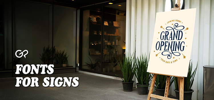
Signs are meant to convey information: directions, promotions, guidelines, messages, and more. That means using good fonts for signs is crucial when crafting your design. After all, people need to be able to easily read your sign. That doesn’t mean the font can’t be creative. The best sign designs effortlessly combine communication with aesthetics. Clean lines, contrasting colors, and eye-catching fonts can all make your message stand out. Helvetica, for example,
There are many types of signs: wedding signs, retail signs, advertising signs, informative signs, decorative signs, and event signs. The types of fonts you use will depend on what your sign is about and where it will be displayed. However, there are general design rules you can follow to create an eye-catching, visually pleasing text layout.

Legibility
Other design decisions contribute to clarity. Don’t overcrowd the design with too much text. Simple and to the point is the best approach for signage. Someone quickly passing by should still be able to understand your sign. Arial is considered the easiest font to read.
What makes a font readable? Simple shapes and clean lines are key. Sans serif fonts, like Arial and Helvetica, are considered the easiest to read. Complicated cursive fonts, like Fabiola and Capellina, might be difficult to read at first glance. Bolded fonts with thick lines also contribute to readability. This ensures the letters stand out against the background.
Balance
The fonts you choose inform the overall impact of your design. If the letters and words are too close together, then people won’t be able to read your sign.
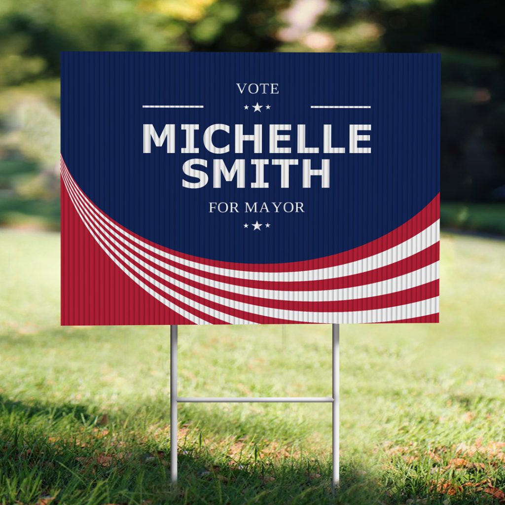
Use fonts to create a visual hierarchy in your design composition. Visual hierarchy is your friend here. This means arranging information in order of importance. Consider a sign with three main text elements: headline, tagline, and information. Use three different fonts, each in a different size. Make sure the fonts you chose look good together. The colors you use for your text should also contrast with the background. A blue text on a blue background will be hard to read, while white text on a blue background will pop.
On a granular level, design balance is also about kerning, which is the technical term for the spacing between characters. Too much space, and people won’t be able to read words from the letters. Too little space, and all the words will blend together.
Professionalism
Different professions will have different takes on what fonts look professional. A doctor’s office likely won’t want to use a quirky font like Crayonette, while that would be perfect for a coffee shop or artist. Typically, fonts like Times New Roman and Arial are considered professional, while fonts like Postino and Fairwater are viewed as unique and quirky.
The fonts you choose should match your brand guidelines. Similar fonts throughout signs, online ads, and mail marketing materials create a consistent visual language for your brand. You want people to instantly think of your brand when they see that font.
Popular Fonts for Signs
- Helvetica: Simple, smooth lines that can still be legible with weathering
- Arial: A clear sans serif font that is super easy to read.
- Futura: A bold font with thick lines that stand out.
- Gotham: A font featuring round, open letters for modern signage.
- Times New Roman: A timeless font that asserts authority and tradition.
- Allura: The clearest script font for signs displayed at weddings, galas, and formal events.
The 1-Inch Rule
Letter height visibility is another important element to consider when setting up your text. That’s why text size is crucial. The 1 inch rule is the general guideline to add 1” to your text for every 10 feet of viewing distance. For example, text on a yard sign should be between 2” to 5”. Storefront signs are often seen from 30 feet away, so the text should be 3”-5”.
What Fonts Shouldn’t You Put on Signs?
Almost any font can look good on a sign – it’s a matter of how you deploy them. However, most sign designers should avoid script fonts and decorative fonts. That’s not to say they will never work on a sign. In fact, they are popular for formal event signs at weddings and galas. These fonts are often used for decorative elements of signs rather than for informative sections, such as seating arrangements and directions. On the flip side, most brands should avoid Comic Sans, which most people do not take seriously as a font.
If you want a quick and efficient sign, stick with serif or sans-serif fonts.