What is the difference between CMYK and RGB printing? If you’ve perfected your design and are ready to order your custom prints, understanding these color modes is crucial to receiving prints that look exactly how you intended. It doesn’t matter if you’re printing business cards or creating custom postcards. Properly preparing your files will help you receive prints you’re proud of.
Most people only consider what looks good on the screen when they’re crafting their design. But the printing process doesn’t stop there. Instead, it all begins with setting the correct color mode for your design. This depends on which medium you intend to use your design for: digital or print. There are two main color modes you need to know about before completing your final product. Understanding CMYK vs RGB printing is crucial to crafting designs that are clear and detailed. Creating your file in the wrong color mode can be a recipe for disaster, as your final product will display colors that are either completely off or inaccurate. GotPrint has already prepared a checklist for ensuring your file is ready to print. But to fully understand why finding the best color mode for print, we’ll walk you through everything you need to know about RGB vs CMYK printing.
First, let’s define the main differences between the two color modes.
RGB Color Mode:
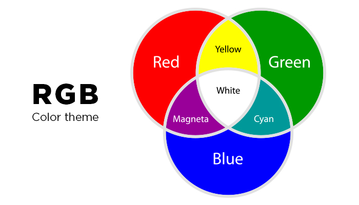
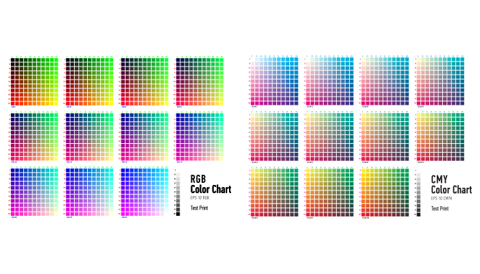
RGB stands for red, green, and blue, which are primary colors. The RGB model is better known as an additive model because the colors are added together to create the images we see on the computer screen. When light from the screen is projected onto the colors, it bleeds them together on the eye’s retina, creating the desired colors, AKA the way we actually perceive colors to be. That’s why the RGB color gamut can cover a variety of colors within the color spectrum. RGB is not considered a print color mode, as it refers to how colors appear on a screen. The primary RGB and CMYK difference is the presence of light. Since a screen emits light, it will change the colors. Print products can only reflect light, not generate it, which impacts how the colors are perceived.
Additive Model
Additive colors, a projected light color system, are created by a method that combines a number of different light colors together. All the colors begin with black, or the absence of light, then different colors (or lights) are added to produce visible colors. Red, green, and blue are the main primary light colors that are used in the additive model. The combination of two of these colors will create a secondary additive color: cyan, magenta, or yellow. This creates the CMYK color wheel.
You’ll often see images in the RGB color mode on digital screens such as televisions and computer monitors (LCD/LED). RGB can only be used by devices that generate light. If you’re wondering when to use RGB vs CMYK, an image designed in the RGB color mode is only good for print if you’re printing your product on a digital printer. Some products that use an RGB color wheel are custom photo gifts, like canvas prints and custom mugs. It’s also useful for graphic designs that will exist in online spaces. This can include social media assets, digital invites, or email marketing art. If you want your design to be printed professionally, then you’ll want to change color modes to CMYK.
CMYK Color Mode:
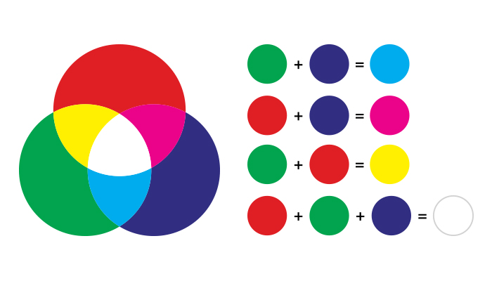
What is CMYK color mode? CMYK stands for cyan, magenta, yellow, and black, and it is a subtractive model – the opposite of the RGB model. That means that the colors are subtracted from natural white light into pigments, which are then printed onto paper in tiny dots. For example, subtracting magenta from yellow will give you the color red. The more colors you add together, the darker they will be, since you are subtracting from the white. The CMYK color model is the standard file presentation for professional printing services. It is used for a wide variety of paper prints, including business cards, custom art prints, quality photo prints, and more.
Subtractive Model
Subtractive colors, a reflected light color system, start with white light/paper. Therefore, the more colors you add together, the darker they’re going to be. The reason behind this is that light is absorbed or removed to create various colors. The key color for the CMYK mode is black (K). Adding this color helps neutralize images and adds density to shadows.
It’s important to note that CMYK inks won’t always produce the same color as your original image. However, there are many possible combinations of CMYK to achieve the same image so that on paper it looks the way it would on the computer in RGB mode. Programs like Photoshop, Illustrator, and InDesign provide CMYK presets that recommend the best combination to choose for a wide variety of press/printer setups.
What is Full Color Printing?
Full color printing is the four-color process that uses the CMYK printing colors. This method blends small dots of the four CMYK colors (cyan, magenta, yellow, and key/black) to create the shades in your art print. It is often used in digital printing and offset printing to produce detailed color quality.
Why Do These Two Modes Render Differently?
Each design is unique – meaning that the amount of white space used and colors blended together will differ from one design to the next. As a result, both RGB and CMYK are rendered differently.
For example, since RGB offers a wide range of colors in its color model, a file that is designed in this mode will have the option to use bright, vivid colors. When it converts to CMYK, a different color model that doesn’t offer that same range, then the conversion results in many of these bright colors falling flat and looking dull
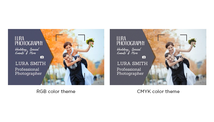
No matter which color mode you create a design in, the colors will look darker in print. Each printer has different requirements for images and graphics, so consulting with the printing company beforehand can help eliminate the chances of your design losing too much of its original color. Check to see what formats the printer is capable of printing in, and gather details regarding file conversions. This will ensure that the print resolution is correct. If you know which paper and printer you will be using, then your file can be converted to CMYK.
When Should I Use CMYK or RGB?
We already noted that RGB is best used for digital media, while CMYK is better for print media. While this is true, many designers still prefer creating their designs in the RGB mode first and then converting to CMYK right before sending it in to print. This is because you have many more benefits when designing in the RGB mode, since RGB has a wider range of color options. RGB allows you to work with smaller files, not to mention that the three most common editing programs (Photoshop, InDesign, and Illustrator) all rely on the RGB format. Lastly, if you want a design that is suited for both web and print, then you’ll already have a file that is web-ready in the RGB mode.
However, if color accuracy is extremely vital to your prints and you want to get technical about your colors being exact, then you should create your design completely in CMYK. Designing in this color mode will definitely help you get a clearer representation of your finished product.
The two different color modes render differently. Choosing to design in the CMYK color mode is one way of making sure the colors in your finished product don’t appear dull and flat. This method is recommended if you have a design that is rich in color, as it provides a better preview of how the color graphics will print. That’s why CMYK is the best color mode for printing.
Conversion Tools
Now that you understand why it’s necessary and important to have your files set in the correct color mode before printing, it’s time to learn how to convert. The most common way designers do this is by designing their image fully in RGB mode, then converting it at the end to CMYK.
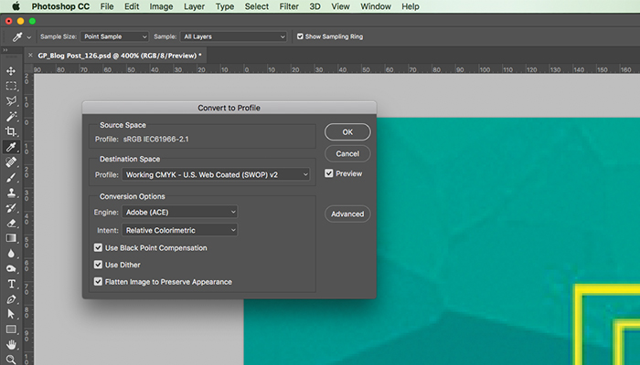
You’ll want to save a backup copy of your file before converting, and remember that the interaction of colors between layer blending modes will change when the mode changes – this is normal. You may flatten your file before converting, but it isn’t required. We mentioned before that Adobe’s Photoshop, Illustrator, and InDesign are the most common programs used for creating designs, and that all these programs rely on the RGB mode. From there, these programs make it easy to convert to CMYK and set a specific rendering intent in order to make your file print ready. This process will ensure you’re selecting the right CMYK color codes. Here’s how:
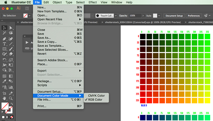
Illustrator: File > Document Color Mode > CMYK or RGB Color.
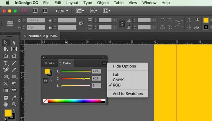
InDesign: Window > Color > Dropdown button in the upper right corner > CMYK or RGB.
Below is a step-by-step tutorial on how to convert color modes to be set for print in Photoshop:
Step 1 > In Photoshop, Select “Edit” then “Color Setting”.
Step 2 > Select a CMYK profile best fit for the final printing conditions.
Step 3 > You can select “More Options” to set the rendering intent when converting the RGB values to CMYK. “Perceptual” is best for photographs because it will preserve the visual relationships of the source image.

Step 4 > Open the RGB image you want to convert.
Step 5 > Make any edits, apply any filters and adjustments while the image is still in RGB mode.
Step 6 > Select “View” – “Gamut Warning” to see any colors that turn gray, which represents the colors that can’t be produced in CMYK. For these colors, Photoshop will select the nearest color it can to replace it, depending on the rendering intent you set beforehand.
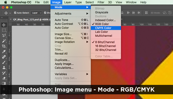
Step 7 > Select “Image” – “Mode” – “CMYK Color”. Remember that some bright colors may change to a dull color after the conversion.
What color mode is used for print?
CMYK color mode is used for print. As we’ve covered, this is the best way to produce prints, like custom invitations, stickers, and marketing materials, that look professional. However, other printing specifications will impact the CMYK color palette for printing. The material you select, such as cardstock paper or signage material, affects the final appearance. A glossy paper stock is best for vibrant designs with bold, bright colors. It adds a reflective shine that draws attention to the design. A matte paper stock, on the other hand, is best for muted or neutral color palettes. Printing on specialty papers, like Linen or Kraft, will also change the final appearance, since the colored material and added texture alter the prints. That’s why it’s important to choose the right paper stock for your business card design. The sign material you select has a similar impact. Color will appear different on a matte vinyl banner compared to a glossy poster. Keep this in mind when creating custom signs. For most custom prints, using a CMYK color mode is the most effective way to receive accurate products.
Ordering prints with GotPrint is another way to ensure your prints are high-quality. All our custom print products, from business cards to foam signs to postcards, are made with premium ink that lasts a long time on the material. The base materials, such as premium paper or smooth acrylic sign, are also well-crafted, pairing the ink with the ideal surface. Not only do we use the finest materials, but we also have excellent equipment, which allows us to use printing methods that result in vibrant shades and crisp lines. Once your file is ready to go in the right color mode, you can trust GotPrint to deliver exceptional prints.