Logos are a vital part of your marketing strategy and brand development, and it’s safe to say that a memorable logo remains timeless. Take the Nike swoosh, the Mcdonald’s “M”, or the Starbucks iconic green color. We are constantly reminded of these logos, but as direct and indirect consumers of these companies, we also have them memorized and can pick them out in a lineup of similar logos. Designing a logo may be a task for a professional designer, but as the person who’s requesting the logo, it’s important that you a) have your vision and inspiration to share with your designer and b) know what would be useful and harmful and shape your vision based on that. That way, when you hire a graphic designer, you’ll have a base understanding of what feedback to give in the creative process. Whether you’re a designer or just a new business brimming on the horizon, these 5 dos and don’ts will be a help to you in creating the perfect logo.
1. Do: Research Your Potential Audience
Don’t: Follow Trends
Research is essential when it comes to logo design, especially because you want to cater your branding to the audience you plan to interact with. If your business plan is geared towards an older demographic, then a classic logo will do just fine (using silhouettes, classic fonts, adding a short 2-3 word slogan, etc). However, if you plan to target a younger audience, your branding should be modern. Modern logo design is all about minimalism & cleanliness.
With that being said, it’s important to note that targeting a younger audience doesn’t mean you should be following trends. In fact, trends could actually be harmful in establishing your brand, because these days, trends come and go faster than a blink, which means your logo could very well be buried in the branding graveyard before you’ve even established your business.
2. Do: Use Legible Fonts
Don’t: Use Too Many Font Types
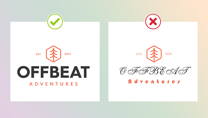
Legibility will always be relevant, no matter what age you’re catering to. Your font selection is vital to your logo, and a font type that’s easy to read is a no-brainer. Be sure not to use too many different font types, because then your logo will look cluttered and unprofessional.
3. Do: Create a Few Variations
Don’t: Change Your Logo Style Often
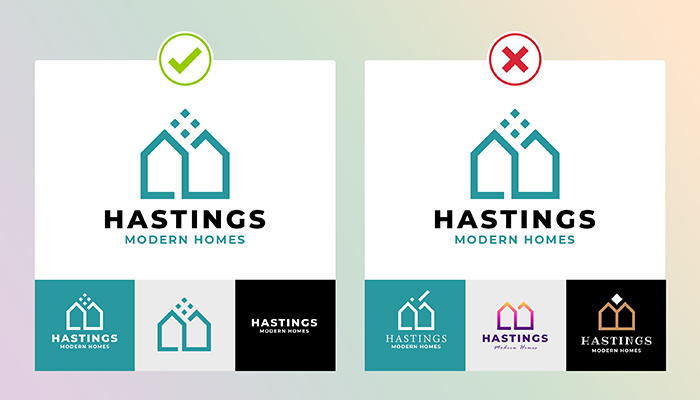
Your logo will be used throughout your entire branding process, from your website, prints, social media, potentially even product tags, and so on. Creating one version of a logo is fine, but if you really want to make sure you can use your branding across all platforms and mediums, we recommend that you create a few variations of your logo so that you’ll have it in your style guide to use as needed. When deciding on a design, make sure you stick to it. Changing the style often can actually harm your brand recognition due to inconsistency.
4. Do: Use Color Theory
Don’t: Overdo Your Color Selection
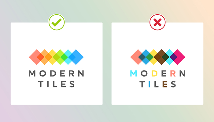
Color theory is a must when designing a logo. You want your logo colors to not only work well together but also to invoke a certain emotion or feeling that’s tied to your brand. Most professional designers have studied color theory and the color wheel, so they are aware of what color mixing is and how to achieve the vision you’re going for. As long as you provide some form of inspiration (even through just text), they’ll be able to help you bring your vision to life. If you are set on a certain color scheme, we recommend keeping it to no more than 2 colors and if absolutely necessary, a third “secondary” color.
5. Do: Take Advantage of White/Negative Space
Don’t: Make Your Design too Detailed
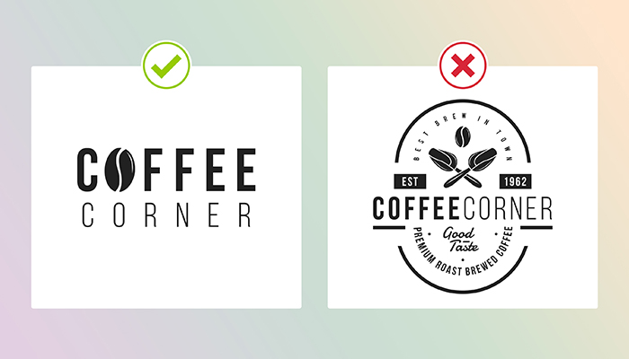
Negative space is anything but negative when it comes to design. Using negative/white space within your logo will actually make your logo stand out more, so if you can incorporate it into your design in a subtle way, you’ll have a solid logo on your hands. At the same time, you must remember that when creating a logo, it’s important to not have too much going on. Having a detailed logo will look tiring to the average eye and is not something that can be used on multiple mediums. Too many elements, too much text, etc, are all things to avoid in logo design.
Do you have a vision for a logo, but don’t know how to execute it? Or do you need assistance with a vision, too? We can help with that! Did you know that GotPrint actually offers Logo Design Services? Our in-house design team has three affordable packages you can choose from, depending on what type of logo you’re looking for. Count on our team of professionals to bring your vision to life and send you the final, approved design in the form of versatile and scalable files. (And, of course, you will own the copyright to the final logo.)
