The best colors for marketing match your brand and entice your audience. The 2026 color trends are a good starting point for planning your marketing strategy in the new year. You don’t need to blindly predict what might be popular. Every year, multiple paint companies determine the color schemes that they believe will define the upcoming year. The Pantone Color of the Year is the most popular, but viewing the alternatives from other design experts paints a more detailed picture of what’s to come. These shades aren’t just for interior design and clothing trends. You can use the color trends 2026 for your marketing strategy and advertising approach in the new year. Get started on your marketing vision boards with these fresh, fashionable shades.
Pantone’s Color of the Year 2026 is Cloud Dancer. According to color psychology, this shade of white has a “calming influence” that is meant to encourage “reflection.” Classic white is also an incredibly versatile design element. As a background color, it provides a sophisticated background that will spotlight your design, photo, or text. As an accent color, it immediately draws people’s attention, as a bright white highlight is visually striking.
Though Pantone is considered the leader in color selection, other paint companies make their own decisions. Benjamin Moore’s choice is Silhouette AF-655. Described as “burnt umber with delicate notes of charcoal,” this dark hue is sophisticated and elegant. Plus, it has potential for matching. Sherwin-Williams chose Universal Khaki SW 6150—an “easygoing neutral” that is both simple and timeless. Clearly, neutrals are in. However, Behr is a slight outlier with a more vibrant shade. Hidden Gem is a rich shade of blue with green undertones. But even this is being pitched as a “new neutral,” since it is dark and easily matches other colors.
Certain design trends stand out within this color spectrum. Grounded neutrals speak to traditional visual styles that pair with just about anything. These earthy tones bring everyone back to basic color schemes that people have long relied on. Even the more playful takes on neutrals are characterized as sophisticated and refined. Classically chic, you can’t go wrong with these utilitarian palettes. Across the board, there is a focus on how these shades amplify connections—to colors, people, and nature. The bolder shades, like the rich blue Hidden Gem, will provide a personal connection to one’s home. This follows basic color theory: neutral shades promote relaxation and harmony. Pantone’s shade of white, in particular, points to light and cleanliness.
It’s clear that the 2026 color trends are a continuation of 2025’s neutral color palettes. Pantone has shifted away from the vivid colors that defined the 2000s and 2010s, like 2017’s Greenery and 2004’s Tigerlily. The brand has spent the last three years championing desaturated, low-key colors. Last year’s Mocha Mousse, a warm brown, followed 2024’s Peach Fuzz, which is a muted pink. It’s back to basics: browns, grays, and whites, with the occasional blues and reds.
Though these color trends are made with interior design in mind, it’s easy to apply them to your marketing strategy. After all, corporate minimalism never goes out of style. These neutral tones are obvious fits for wellness brands, makeup companies, and tech products. But other brands can also fit this aesthetic. Since these colors are so versatile, you can easily add the rich shades and warm palettes into your promotional strategy or brand refresh. They will likely pair well with your pre-existing brand colors. You can use these shades as background colors in graphic designs and across your website. For social posts, like TikTok videos and Instagram Reels, you can select one of these colors as the backdrop for your products or models. Switch up your website banners or other graphic design elements to incorporate the colors. Even your digital ads can reflect these trends if you update your assets.
Print marketing materials present the best opportunity to experiment with these color palettes. After all, Pantone’s color selection always has a huge impact on marketing materials, product design, and packaging styles. Your brand campaigns for seasonal products, short-term promotions, and upcoming product launches let you test these colors. All your designers should consider how they can accomplish this. It can be as grand as a billboard with a professional khaki background. But it can be as simple as a custom poster within your storefront or office that elegantly uses white space. You can also use window clings or window decals with trendy designs as a way to increase foot traffic. For custom signage, these simple colors are sure to make the rest of your design, like text and photos, stand out. Your storefront displays will ensure shoppers know that your brand is modern and contemporary.
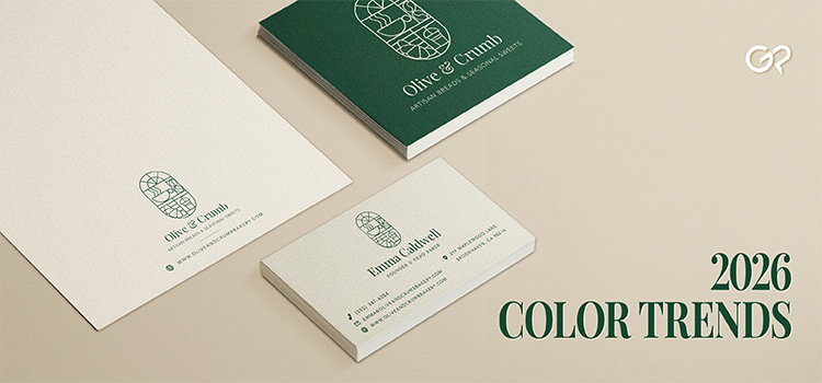
Mail marketing and other related prints also allow for design experimentation. Marketing postcards are an affordable print for new designs. 4” x 6” postcards, in particular, are a versatile marketing tool for showcasing products or services. You can plan product photoshoots that integrate these colors, or you can create brand artwork, like illustrations or cartoons, with these palettes. You can mail them to specific zip codes or slip them in shopping bags. Similarly, you can print custom flyers to distribute near your storefront, community centers, or events. Brand stickers are also a product detail you can easily update to display current aesthetics. Print custom stickers to add as a freebie with purchase, seal boxes, or decorate mailed packages. Plan an entire matching marketing tool kit that features coordinated prints.
Paper Stocks
The paper you print your design on is an easy way to capture the crisp Cloud Dreamer. A classic white paper stock reflects the popular white shade. 14 pt. Gloss Cover adds a shiny surface to the white paper, while 18 pt. Ultra Premium Smooth White is a thick cardstock that has a mature matte finish. For a truly luxurious print, the 18 pt. Ultra Premium Pearl has a radiant, shimmery finish and a natural pearl color. Leaning into the natural paper appearance is an easy way to use this year’s official color.
Graphic Design Trends
Just using trending color palettes isn’t enough. You need to use design trends that feel contemporary and appropriate for the colors. Thankfully, the 2026 graphic design trends are perfect for these neutral palettes. Minimalist designs are always in style; corporate artwork featuring simple layouts, clean lines, and concise text will beautifully show off your products or services. Since white complements every color, it’s easy to find ways to add it to your design. For 2026, bold minimalism is taking over. Think round fonts, simple photos, and sharp contrast. It’s about highlighting one essential element. Cloud Dream is the ideal shade to convey that, since it’s perfect for minimalist designs. Balance large typography and uncluttered photos with intentional negative space for an eye-catching display. Simple Serif fonts are also trending, which perfectly fits into this style.
However, maximalism still has its place. Busy layouts, contrasting textures, and chaotic visuals all promote excitement and enthusiasm. It might seem difficult to pair this approach with grounded, earthy neutral colors. But the basic colors could nicely contrast with the complicated design style. Whatever approach you take, your marketing prints need to focus on selling your brand above anything else. The visual styles should speak to your target audience.
Don’t feel forced to use these colors if they don’t fit your brand. Customers can tell when brands are chasing trends that are obviously inauthentic to their company style. It’s all about making the trends work for your brand, instead of making your brand match the trends. That’s why these annual color trends are just that: trends. Pivoting to meet them is a valuable marketing skill. But, at the end of the day, you want to keep your company’s core visual styles in mind. Chasing styles that don’t speak to your products or your clientele will only hurt your brand. Exploring these trending colors shows that your company is on the cutting edge of what’s popular—and, by extension, how your audience is evolving.