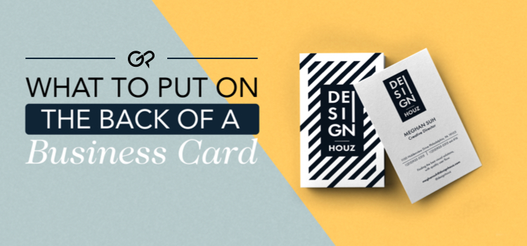
You’re not making the most of your marketing efforts if you aren’t utilizing the back of your business cards. Providing contact information in your card design is only one part of creating a card that leaves a true, lasting impression.
Commonly left blank, many don’t consider adding additional information on the backs of their cards because they tend to overlook the idea that your cards are essentially a mini portfolio for your business.
A misconception about business cards is that the back of your cards are best left blank for note-taking. However, by doing this, you could be missing out on promoting your brand to the fullest.
That being said, you don’t want to overcrowd both sides with too much extra information. Taking advantage of both sides of your cards gives you the leeway to add more info without cramming too much in – making your cards breathable with content. In other words, it will allow your business to remain exclusive and professional without seeming needy.
Here is a list of helpful ideas that will assist in making your cards more than just a point of contact.
List of Services/Products
Without overdoing it, it’s always clever to include a mini list of services and/or products your business offers. The purpose of this list is to provide customers with a quick reference of the top items your company can provide for them.
The list is also a reminder of what it is that you do. Without any specifics on your card, your prospective customers are more likely to forget who you are and toss your card out.
The back of your card is the perfect space to add this shortlist without compromising white space and having to worry about clutter.
If you make your list too broad, your clients’ eyes may glaze over the content, defeating the purpose of providing a list. Therefore, it’s smart to add just your top services, best-selling products, and/or best prices.
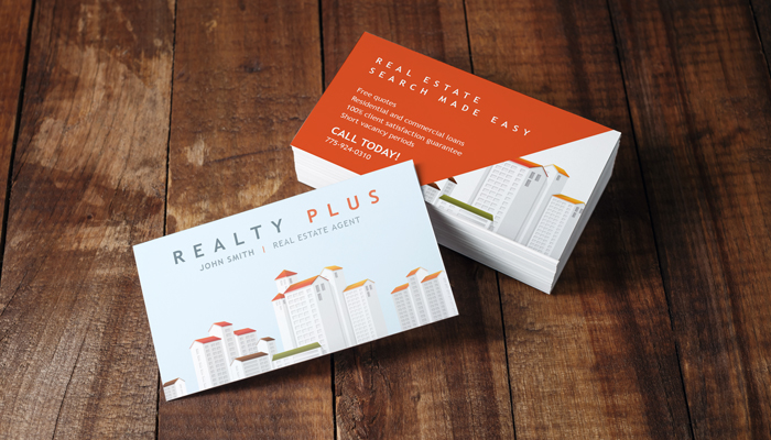
Eye-catching Imagery
If you are a photographer, graphic designer, illustrator, artist, or anything creative, then use this space to showcase your work. A picture says a million words, so rather than leaving the back of your card blank, you should fill it with a high-quality image, a mini work of art, or a captivating logo to fill the space with something special and personal.
Make sure to avoid using any type of clip art. This type of imagery is what risks making your brand look cheesy. Cards will be kept longer if there is a beautiful image that comes from a legit source. It is worth every penny to invest in hiring a professional photographer or artist to add that extra edge to your cards.
If you’re already a photographer or an artist, then there is no reason why you shouldn’t take the opportunity to use the space given to you on the back of your card so that you may give your prospects a taste of your portfolio and quality of work.
Special Offer
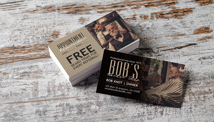
It’s hard to throw out a card that includes an offer that is hard to refuse. This offer can be good for anything from discounts to free gifts/services.
Online marketing consultant Don Crowther suggests that your business cards “include a mini-resume, your [social media] handle, and some sort of special offer that entices each recipient to get in touch.”1
You can also entice people to opt in to an email list in exchange for a free gift or a discount. This is a great way to capture emails and spark that initial contact, especially if you are in a situation where you are giving out your cards in masses and don’t have the opportunity to meet with the people that are receiving them.
Whatever you decide to choose as your special offer, make sure it is relevant and hard to turn away. Your cards are more likely to be saved if you utilize the back to offer something of value.
Lead Magnet
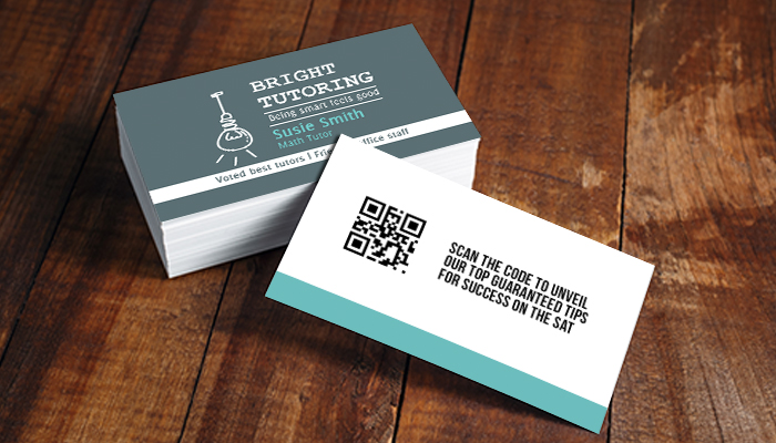
A lead magnet is an offer that is hard to resist and redeemable in exchange for contact information, so that you may build a more loyal audience while building your business. The back of your business cards is the perfect placeholder for an offer that will capture and generate leads.
Tailoring your marketing message into your business cards is a proven way to draw in more profit. According to the marketers at You Can Market Online Now, by strategically placing your marketing message in front of your targeted niche market, you are creating at least 25% more business.2
The act of handing out a business card already implies that the recipient has shown some sort of interest in your company and services. Therefore, to include a lead magnet on the back is smart on many levels, mainly because your targets will already be interested in opting in to your offer.
Try out a few different simple but concise lead magnets and see which garners the most/best responses. Once you’ve honed in on the best strategy and messaging, you’ll be on your way to bringing in dedicated clients. From there, you’re able to recapture and retarget your leads so that you have a way to connect with them again.
Examples
- Sign up at www.websiteURL.com for your free handbook on how to lose 5lbs in 1 week!
- Email us at websiteURL@email.com and gain free access to our exclusive Photoshop tips!
- Scan this QR code to unveil a free online marketing course!
Referral Cards
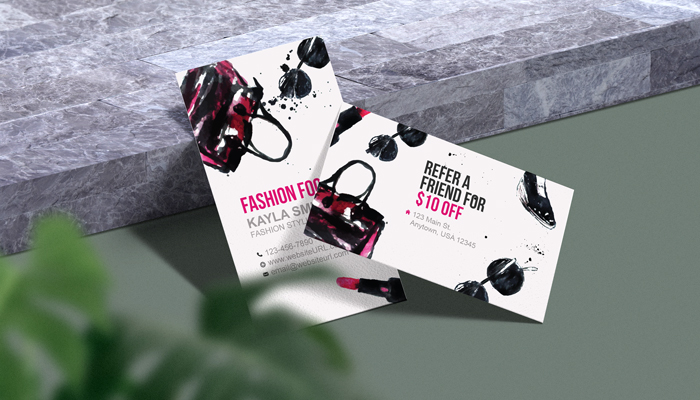
Your cards become versatile when you use the back for something more than just your standard business card. If you use the backspace of your cards to make an offer from a referral, you could be finding yourself bringing in a sea of relevant clients because word-of-mouth has never failed to work as one of the best marketing tactics.
A business with a good reputation is often because people can’t stop raving about the company to their friends. If you add to your cards something like, “Refer a friend for $10 off your next appointment,” the number of new clients will increase.
Referral cards are simply the best way to expose your business to a greater community of potential clients. So if you are stuck on what to include on the back of your business card, don’t just leave it blank, a simple referral with an offer looks clean, professional, and will only do your business good.
Essential Life Tips or Fun Facts
People will hold onto your cards if there is information on there that is vital, useful, or helpful to their everyday lives. You can impart some of your knowledge on the back of your cards as it relates to your industry.
Examples
- If you are a traffic lawyer, you can write down a list of Rights in case a client ever gets pulled over
- CPR instructions for medical-related businesses
- Toll-free help hot-lines if you are a doctor/therapist/psychologist
- Stress relief tips
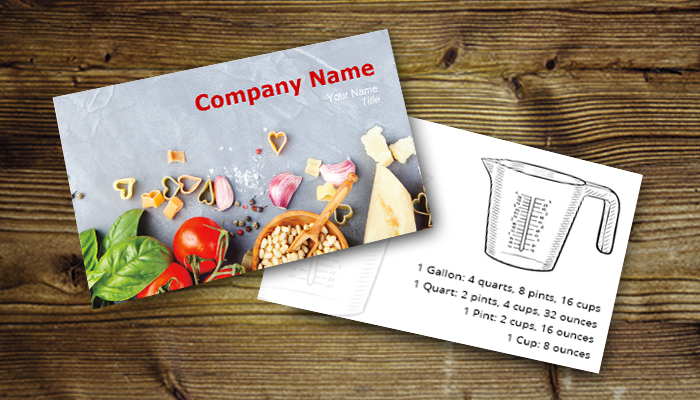
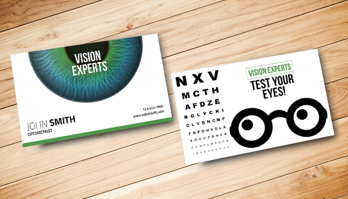
You can also add fun facts for reference to keep people engaged with your cards. Go the extra step and add a different fact to each card, luring your clients to want to collect many of your cards, and, as a result, they will have multiple cards reminding them of your contact information. Or, make your cards interactive by inserting a quiz or test that your clients can easily participate in.
Examples
- Zodiac signs if you are an astrologer
- Diet information
- Car care checklist
- A ruler or other forms of measurements
- Fortunes, if you’re a psychic
Profile Photo
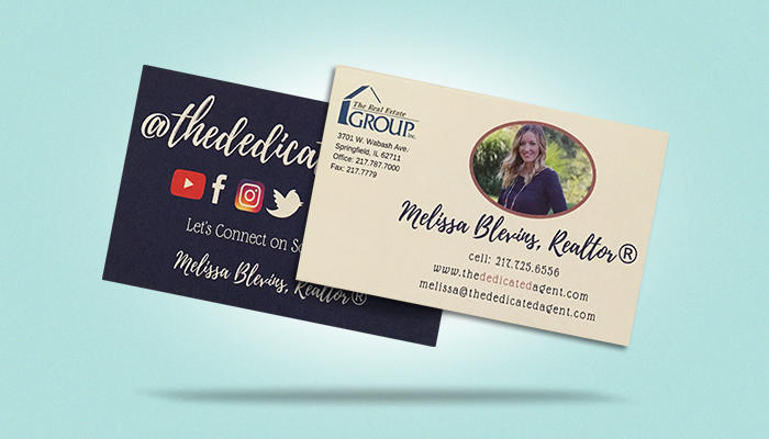
Some feel that adding a photo portrait is cheesy, but at the end of the day, people will remember your face and who you are when there is an image right there to remind them. This is one of the most practical ways you can make your business card memorable.
This particularly comes in handy when you are in places like conventions or trade shows. Clients will collect multiple cards throughout their day. The cards that include a self-portrait are the ones that will jog their memory of who you are in a sea of cards that probably are of the same industry and may even have the same first name as you!
By having the extra space on the back of your card, you have the ability to strategically place a profile photo without it looking awkward or misplaced. Consider this option for those networking events where putting a face-to-the-name becomes essential.
What’s on the Back of Your Business Card?
Your turn! Tell us what type of things you like to include on your business cards. Is there anything missing from this list? Let us know is the comments!
Once you’ve chosen your perfect layout on the front AND the back of your card, head over to GotPrint to get your order in today!
Sources:
