
Your message, that is.
Humans have an attention span of I believe, 2 seconds. (I’m going against modern science, I think the 8-seconds is really decreasing rather quickly.) But that’s just what happens when you’re a part of the new generation of high-tech gadgets, information overload, and billions of different entertainment activities. So why not make your message short, sweet, and sticky (literally)? Because, let’s face it, you have no choice here. That way, potential customers will see your logo or brand in its entirety without becoming absorbed into some other catchy, colorful, and concise display right next to it.
A great way to achieve this attention-monopoly is through the use of a sticker. To create your sticker, think of what represents you or your company. Highlight these elements with a visual image that draws in the potential customer. Make sure to also display your company logo or slogan in a unique way to create an interest for your customer. You might consider reinforcing your company’s image through the use of pictures, colors, shapes, and patterns that represent your goals and attributes.
And if you need a little inspiration and helpful tips, I included some great examples on how some of our customers made it STICK, as well as some guidelines for how you can create your own sticktastic sticker:
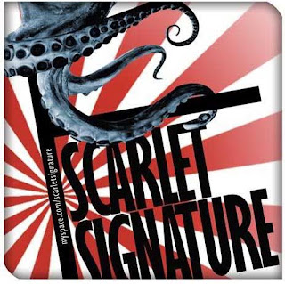
Guiding Shapes. Very creative and eye-catching, and the stripes seem to guide you toward the brand name. So does that vicious octopus. Genius.
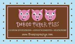
The three little pigs. This sticker obviously hints at a famous fairy tale. Note to self: Allusions to art, culture, and literature are always effective – at the very least, they’ll attract bookworms and pop-culture maniacs. Think Andy Warhol. It’s something you’re sure to not forget. I know I didn’t.

Colorful and provocative. The colors and the images pop out at you. What isn’t catchy about it?

Think geometric. As humans, we’re attracted to simple shapes, because our brains just work that way. This sticker almost can’t fail. You either see the snowflake first if you’re a picture person, or the brand name, Truckee Snowflakes, Etc., if you’re a text person. Both happen to point to the same thing: the company name. And, to top it all off, it represents the company well (handmade art pieces). Two tactics, one successful result.
Simple, nice, and a little bit of spice. Black, white, and red, very concise and almost Mod. This sticker represents a lot about what the t-shirts may look like, without the extra fluff for those who hate looking at anything for more than 2 seconds.

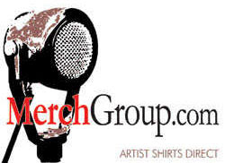
Repetition works best. This company incorporates the widely known and common marketing rule that if you repeat enough (in this case, the name of the company is emphasized with not only the full name but the initials), the customer is bound to remember. From the repetition of “M’s” to the symmetry, it basically carves the logo into your brain for you.