We may be taught to never judge a book by its cover, but the truth is, many of us will judge a brand by its business card. Although business owners should be innovative and original when it comes to their branding, there are some universal guidelines we recommend in order to ensure your business cards look polished and professional.
Whether you are designing your own cards or working with a graphic designer, make sure you avoid the following mistakes, which could cost you valuable business!
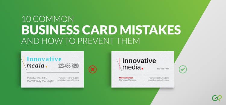
Mistake #1: Not Using a Template

Use the correct business card template for your desired size and shape. The templates will be marked with the safety line, trim line, and bleed line. Your text and images need to be within the safety zone, but any background elements should extend all the way to the bleed line.
Don’t forget to delete the template layer prior to flattening and/or saving the final design file. Most printing companies will print exactly what you submit without double checking the file. If you forget to delete the template layer, there is a good chance your business cards will print with the template lines visible.
Mistake #2: Designing Your Cards in RGB Mode

Your file should be designed in CMYK mode or converted to CMYK before you print. Although many other commercial printers will print your RGB files, images created in RGB color mode can appear dull and mismatched once printed. (For a detailed explanation on the difference between RGB and CMYK, click here.)
Mistake #3: Not Utilizing the Back of the Cards

Printing on both sides of the card is a small upgrade that pays off in multiple ways. Use the back of your business card for appointment reminders, social media handles, mission statements, or anything that will give your card – and your business – a competitive advantage. We are such strong advocates of double sided business cards that we even wrote an entire blog post about it!
Mistake #4: Uneven Borders Around the Edges

A delicate border around the edge of your cards may look great on screen, but that same border can look off-center on the final product. Generally speaking, borders are not recommended because slight shifts can occur during cutting. For small products such as business cards, even half a millimeter of cutting shift can cause the borders to look uneven.
If you really love the idea of having a border design, choose either a thick border that extends to the edge of the artwork file and well within the safety zone, OR choose a thinner border that is contained entirely within the safety zone.
Mistake #5: Too Much (or Too Little) Text

Many business owners fall into the trap of wanting to include as much information as will fit onto their business cards. However, it’s better to impress recipients with high-quality business cards that focus on your company’s strongest features or unique value propositions. Keep the focus on your most popular services, and as you began working with new clients, you can slowly incorporate the additional skills you bring to the table.
On the other hand, trying too hard to appear “mysterious” or “exclusive” by including only the bare minimum information can quickly backfire. Unless your goal is to retain as few clients as possible, you want your business card to demonstrate that you are approachable and results-oriented.
Mistake #6: Your Text is Hard to Read

Don’t design a business card that makes people squint! Although it will vary depending on the typeface, a good rule of thumb is to use 11 – 12 pt font for the company name and no smaller than 8 pt font for contact information or any other secondary text.
We also recommend avoiding light colored text and making sure the text and the background are contrasting shades. You don’t want to use a dark font on a dark background!
Finally, avoid script or decorative typefaces for anything other than the logo or company name, as they can be difficult to read. Your name, title, and contact information should be presented in a clean, non-ornamental font.
Mistake #7: Your Card Doesn’t Match Your Brand

The key to building a brand is consistency! Make sure your business card’s color scheme, fonts, and graphics match the tone of your website and other company assets. Your brand’s aesthetic, whether minimal or ornate, should be reflected throughout your printed materials.
Mistake #8: You Choose a Flimsy Paper Stock

When ordering your cards, it may be tempting to go with the least expensive paper option. However, choosing a noticeably thin stock can reflect poorly on your brand. If you’re not sure which stock is best for you, we recommend picking one of the 3 following options:
14 pt. Gloss Cover: This long-lasting, heavy paper is our most popular stocks for business cards and postcards. The UV gloss coating has high color saturation for exquisite contrast and range, plus provides protection against stains and damage.
16 pt. Premium Matte Cover: Choose this uncoated paper stock if would like to hand write appointment reminders or personal notes on the back of your cards, or if you would like your business cards to have a softer, vintage-inspired appearance.
24 – 38 pt. Trifecta Ultra-Thick: Available in Green, Red, Black, and Kanvas, this luxurious, triple-layered paper stock is the ultimate choice for high-end brands, corporate executives, and designers.
Mistake #9: Your Cards are Too Unconventional

When it comes to your business cards, it is possible to be too creative. Some business owners opt for oversized cards or cards printed on unusual substances such as metal, wood, or edible materials. However, these expensive efforts to stand out can quickly backfire, as your business cards will be heavy, unwieldy, and ultimately not practical.
Our special shape business cards are an affordable choice for companies looking to give their cards a unique twist. For example, leaf business cards have an organic feel that is popular with spas and natural food stores. A square business card is an unexpected shape that works with both intricate and minimal designs. Modern slim business cards provide a sleek canvas for artists and tech companies.
Mistake #10: Your File is Low in Resolution

All of your elements should be set to 300 – 350 dpi (dots per inch) or ppi (pixels per inch). When file resolution is lower than 350 dpi, the final print will have a substantial drop in image quality. Be careful when using pictures that you found online – many of those images are only 72 dpi (not to mention you may be infringing on someone’s copyright).
For a more detailed explanation on how to best prepare your files for print, check out our Preparing Files page. You can also refer to this handy file checklist while designing your business cards.
We hope these tips are useful to you, but we did want to include one last cautionary note. Ultimately, the most egregious mistake of all may be not having a business card when you need one. Exchanging business cards at meetings, trade shows, and conventions is far more efficient than pulling out your phone and asking new contacts to spell out their names or repeat their phone numbers. A high-quality, well-designed business card is an inexpensive time-saving investment that you can’t afford not to have.